Work Play About Resume

Interaction Designer · ArtCenter M.Des
Hey, I'm Emma. A designer who loves real people, messy problems, and a good challenge.

Capstone & Thesis In Progress
Airline Interaction Design 2036 cover
Airline Interaction Design 2036 Aviation · Futures / Service Design
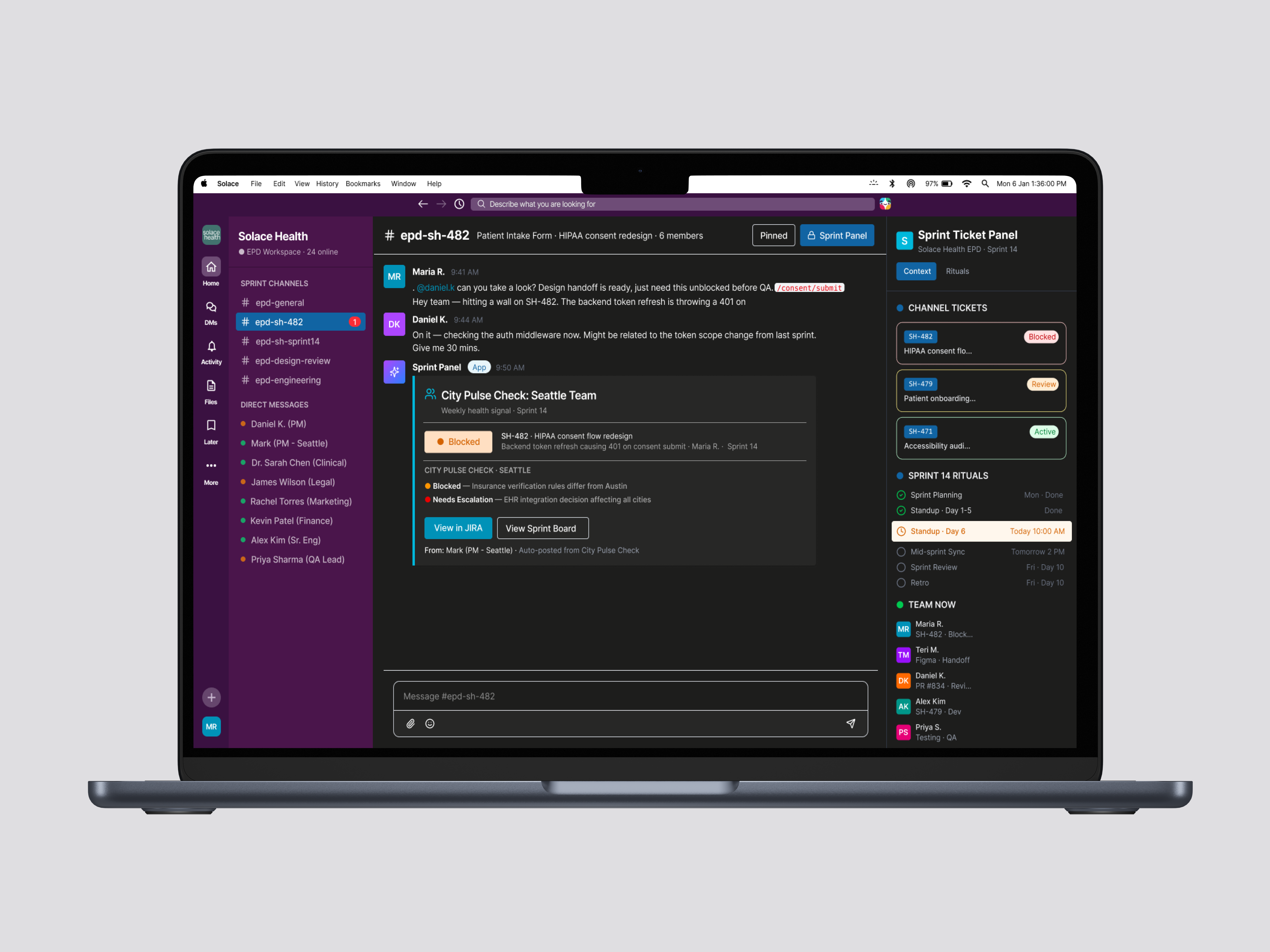
Solace Health: Sprint Ticket Panel
Solace Health Healthcare · Systems / Process
COROS cycle-aware training dashboard
COROS Wellness · Service Design
Airbnb group booking screens overview
Airbnb Group Booking Travel · Concept Redesign
Gauge: Vehicle Report App
Gauge Enterprise · Self-Initiated
01 · Case Study

Airline Interaction Design 2036

When the airline knows what you need before you do, who is really in control? Designing the interaction layer for a future where AI-driven anticipation has replaced most active passenger decision-making.

RoleSole Designer & Researcher
DomainAviation
Duration14 weeks
MethodsFutures, Service Design, Sci-Fi Prototyping

Airlines are investing heavily in anticipatory technology (AI rebooking engines, biometric identity, ambient spatial interfaces), but they're designing for efficiency, not trust. Delta's AI concierge can already rebook you during disruptions. Biometric gates are rolling out globally. Parallel Reality displays at Detroit show personalized information to 100 passengers on a single screen.

The technology is arriving. The question is less about what it can do; it's what it should feel like. Imagine a system that acts on your behalf and leaves you feeling more in control, not less: it books the trip, clears the morning, routes around the delay you hadn't noticed yet, and not once do you feel watched. The difference between served and surveilled was never capability. It's legibility — whether you can always see what it's doing, and why. That's the future worth designing.

I conducted a STEEPX analysis mapping emerging signals across social, technological, economic, environmental, political, and experiential dimensions. A Causal Layered Analysis dug beneath the surface-level technology trends to identify deeper structural beliefs.

STEEPX analysis mapping signals across social, technological, economic, environmental, political, and experiential dimensions
STEEPX: mapping the forces shaping airline interaction by 2036
Every signal converged on the same finding: the barrier to anticipatory systems isn't technology. It's trust.

Socially, post-pandemic travel anxiety is baseline. Technologically, the capability exists but adoption moves at the speed of trust, not innovation. Economically, dynamic pricing makes passengers feel surveilled, not served. Politically, biometric consent is now legally mandated interaction design. Experientially, passengers benchmark against Amazon and Apple Pay, not other airlines, that gap is structural.

Causal Layered Analysis map digging beneath technology trends through litany, systems, discourse, and myths
Causal Layered Analysis: from the surface litany down to the underlying myths

The CLA and service blueprint surfaced three design mechanisms that became the project's backbone:

Adjustable autonomy. The system proposes, the passenger decides, and it remembers your preference. Not a binary on/off for AI, but a spectrum of control the passenger can move along.

Explainability. Every AI decision shows its reasoning in plain language. When a flight cancels, the system offers three reroute options with tradeoffs: fastest arrival, best seat, most flexibility. It shows its work.

Resourcefulness. The system doesn't just recover from disruption. It finds new possibilities within it. Trust is earned not just by explaining and offering choices, but by being genuinely resourceful when things break.

Service blueprint mapping the passenger journey, system actions, and backstage processes
Service blueprint: where the three mechanisms surface across the journey
The airline isn't trying to be invisible. It's trying to be a good host.

This thesis directly challenges the prevailing UX orthodoxy that the best technology is invisible. A good host is present but not intrusive, explains without lecturing, anticipates without presuming.

Narrated speculative film: Noah's journey, Portland → Chicago → D.C.

The project culminated in a narrated speculative film following Noah Almeida, an urban resilience planner flying Portland → Chicago → D.C. for a federal grant review. A storm cancels his Chicago connection. Under today's system, that's a rebooking desk, hold music, and a missed meeting. Under the 2036 system, the airline preemptively reroutes him through JFK, books an air taxi to D.C., adjusts his hotel, and sets his alarm, all while explaining what it's doing and giving him the choice to override.

Each scene was designed to test a different design mechanism: adjustable autonomy during the reroute, explainability when options are presented, resourcefulness when the system finds the air taxi alternative.

Supporting deliverables included the STEEPX analysis, Causal Layered Analysis, a future persona, a service blueprint, an Actor-Network Theory map, and five speculative design briefs.

The hardest design decision was resisting the urge to make the system invisible. The instinct in anticipatory design is to remove friction entirely, to make things "just work." But the CLA's deepest layer revealed that human agency is non-negotiable. A system that acts perfectly but invisibly isn't a good host. It's a benevolent captor.

The project's core argument: technology that anticipates your needs isn't enough. It has to show its work, give you choices, and be genuinely resourceful when things break. That's not invisible technology. That's a good host.

02 · Case Study

Solace Health

Designing the collaboration system, not just the interface. A multi-city expansion framework that makes misalignment visible before it compounds into delays, rework, and launches that miss the market.

RoleFramework Design Lead
DomainHealthcare
Team4 Designers
MethodsSystems Design, Process Design

Solace Health is a women's healthcare startup expanding from Austin across five cities. Growth exposed a structural problem: every city has different regulations, demographics, and clinical needs, and Austin's core team was making product decisions in isolation.

Six months before a new-city launch, three critical breakdowns were already in motion. The PM drafts roadmaps without cross-city input. Engineering hits architectural conflicts mid-sprint. Design discovers city-specific requirements after designs are already approved. The result: 6-8 month launch delays and $1.5M+ in wasted labor on rework alone.

Problem timeline showing delays and rework costs
Breakdowns compound across the launch cycle

We surveyed and interviewed 13 engineers, product managers, and designers across companies including Meta, Netflix, TikTok, Indeed, Walmart, and SAP. The synthesis surfaced a core tension that reframed the whole brief: everyone is drowning in communication but starving for context. The problem was never too few messages; it was that none of them carried the context a decision actually needed.

When feasibility, direction, and customer value are answered early, all three disciplines are energized. But clarity is never spoon-fed; alignment has to be forged collectively.

Decisions happen without the people closest to the problem. The tools aren't broken; the gaps between them are. No tool bridged the space between disciplines, forcing teams to rely on meetings and tribal knowledge to stay aligned.

The solution isn't a single artifact; it's a system. Three interconnected layers, each reinforcing the others.

1. The Ritual: Pre-Kickoff Alignment Call. A structured 60-minute call before every city launch. The local PM presents first: local context, clinical constraints, demographic insights. Austin listens before it leads. A weekly async City Pulse Check keeps alignment alive between calls.

2. The Framework: Launch Readiness Canvas + Decision Context Log. Every section has a named owner. The Canvas captures decisions and local adaptations during weekly calls. The Decision Context Log persists across launches, the next city inherits it. It's required reading before any new PRD.

Launch Readiness Canvas and Sprint Ticket Panel
Launch Readiness Canvas with Sprint Ticket Panel

3. The Tool: Sprint Ticket Panel. A lightweight plugin that connects across Jira, Slack, and Notion. In Jira, a side panel provides sprint visibility with active blockers and team health. In Slack, it generates dedicated channels for each ticket. An AI Health Summary suggests actions without deciding for you.

Sprint Ticket Panel in Jira Sprint Ticket Panel in Slack

Teri is a designer on the Chicago expansion. Early in sprint, she catches an assumption that doesn't hold in this market. Under the old way, that flag gets buried. The sprint ships. The wrong assumption goes with it.

But here's what happens instead: Teri flags it right where she's working. Her flag surfaces in the weekly async. The right people see it. If it needs a decision, it routes to the alignment call. The decision lands in the Decision Context Log, documented, not lost. The log feeds the retro. The learnings shape the next cycle.

That's the point. Not to eliminate the hard decisions, but to catch misalignment early, before it compounds.

We conducted two rounds of usability testing with EPD professionals. The most telling finding: people didn't reject AI assistance; they rejected AI that didn't give them a reason to trust it. Auto-scheduling was universally rejected. We moved the AI Health Summary into the Sprint Ticket Panel and provided two recommendation options instead of one, giving users agency.

Sprint Ticket Panel: Solace Health

This project changed how I think about what designers can, and should, design. Working at the systems level meant designing rituals, decision flows, and knowledge structures instead of screens.

The core insight: psychological safety isn't just a value to aspire to — it's designable. The Pre-Kickoff Alignment Call puts the local PM first so Austin listens before it leads. The City Pulse Check makes flags visible without requiring someone to interrupt a meeting. The Decision Context Log means a designer can see what happened to her flag without asking. These are psychological safety mechanisms, not just principles.

Team culture isn't a soft problem separate from the "real" design work. It is the design work.

03 · Case Study

COROS Menstrual Cycle Redesign

What if a fitness tracker actually understood your cycle and used it to make you a better athlete?

RoleService Designer
TypeSolo Project
DurationOne Term
ToolsFigma, Miro

Hormones shift across a woman's cycle, and those swings can shape how she recovers, how she sleeps, and how training feels from week to week. The effect is real but highly individual. It's a pattern worth designing around, as long as the design leaves room for the person in front of it. COROS is excellent at reading the body (training load, recovery, HRV), yet it did nothing with the one variable that quietly reshapes all of those readings every month. Cycle data, where it existed at all, sat in a separate calendar that never talked to training. As a COROS user who cares about women's health, that gap nagged at me: connect the cycle to training, and it stops being a nice-to-have feature and starts making her a better athlete. Wearables are still tuned to the male body by default, and the cycle is exactly the signal that default leaves out.

Midway through, COROS shipped their own version. It confirmed exactly what I'd wagered on: a basic period calendar, shaky ovulation predictions, and no line drawn between the cycle and how you actually train. The capability was there. The connection wasn't.

Current COROS cycle tracking screens

Working from the outside, I mapped the service as best I could: the frontstage from the app itself, the backstage inferred from how it behaves. Even at that resolution, it broke in the same place everywhere: there's no loop. Data flows in (cycle length, symptoms, sleep) and nothing meaningful flows back out. The user does all the logging and gets a calendar in return. That single structural gap became the thing the entire redesign had to fix; every decision below traces back to it.

Current service blueprint

I benchmarked COROS against Garmin, WHOOP, Oura, and Fitbit, but the read that mattered wasn't the feature grid. COROS is genuinely strong at the hard part: training load and recovery intelligence. Where it falls behind, and where most trackers do, is the last mile: turning that physiology into something a woman can act on this morning. So I didn't set out to design a new feature. I set out to build the bridge between the intelligence COROS already has and a decision the female athlete can actually make today.

Competitive analysis matrix

I rebuilt the service so every touchpoint has to earn its place by connecting cycle data to a training decision. The backstage stops being a passive store: it learns from behavior, sharpens its predictions over time, and finally closes the loop the audit exposed: data in, guidance back.

Ideal service blueprint

My first instinct was to teach everything up front. If hormones reshape training, the app should explain the whole cycle before you start — so I built a heavy educational onboarding: phase by phase, hormone curves, the works. It tested clunky. Nobody wants a biology lecture between turning the feature on and actually using it, and by the time people reached the dashboard they'd forgotten most of it anyway.

So I cut onboarding down to what genuinely has to happen before you can start: one idea and two questions. The intro teaches a single principle, "work with your body, not against it." The setup asks only for your last period and average cycle length. Everything else moved into the app itself, surfaced the moment it's useful: tap into your current phase and it explains that phase, its hormone curve, and what it means for your sleep, strain, and training that day. The accuracy caveat moved too. Instead of a disclaimer buried in setup, the dashboard just reads "Learning your cycle, 1 of 3." The app earns trust as it goes rather than demanding it up front.

Education is still the whole point; I just stopped front-loading it. The phase insights are the part I'm proudest of: each phase explained right where you'll use it, and honest enough to hand authority back to your own body instead of the calendar. The menstrual screen says it plainly: "track how you respond, and let your effort follow your energy, not the calendar." Cycles are deeply individual, and the lazy version of this product hands every woman the same phase-by-phase prescription. I wanted the design to guide without dictating, and to always defer to how she actually feels.

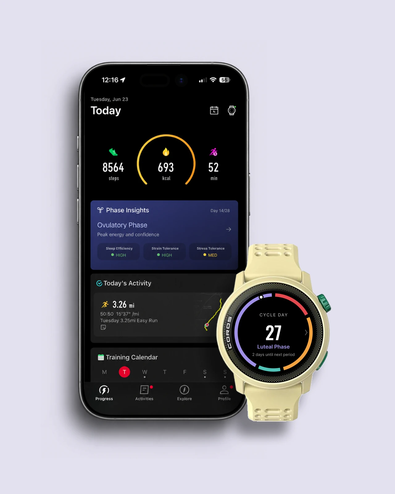
In the current app there's no phase insight on the dashboard at all. To learn about your phase you open the cycle tracker and read a wall of text about potential effects, in one place, while your training lives in another. Closing that gap was the entire goal, and the home screen is where it happens: right under your daily activity, a Phase Insights card names where you are in your cycle and translates it into today. Ovulatory phase, "peak energy and confidence," with sleep, strain, and stress tolerance read out as high, high, medium. Cycle and training now sit in one glance, already connected, instead of in two places you're left to reconcile. You don't go find the connection. It's already made.

COROS redesigned screens

I started this project because I care about women's health and believe athletes deserve tools that understand their physiology. When COROS shipped their version mid-project, I got to test my research-driven approach against what a real product team actually built. Humbling and validating at the same time.

Mapping the full service forced me to think past the screen: the data pipelines, the CS workflows, the PM tradeoffs that quietly decide what a user ever sees. I approach every design problem differently now because of it.

This one stayed a concept, so I never got live numbers. But if it shipped, the metric I'd watch isn't downloads; it's whether people are still logging in month three. That's the only real proof the loop gives something back.

04 · Case Study

Airbnb Group Booking

Group trips shouldn't fall apart before they start. We redesigned how Airbnb handles the hardest part — the money.

RoleProduct Designer
TeamEmma Moystner, Kate Foote
Duration4 Weeks
TypeConcept Redesign

Airbnb's lack of streamlined group booking puts the entire financial and logistical burden on one person, making trip planning and payments harder for everyone involved. We redesigned the group booking experience from research through high-fidelity prototype, introducing shared trip planning, flexible cost-splitting, and a centralized group hub that gives every traveler visibility and agency, not just the person holding the credit card.

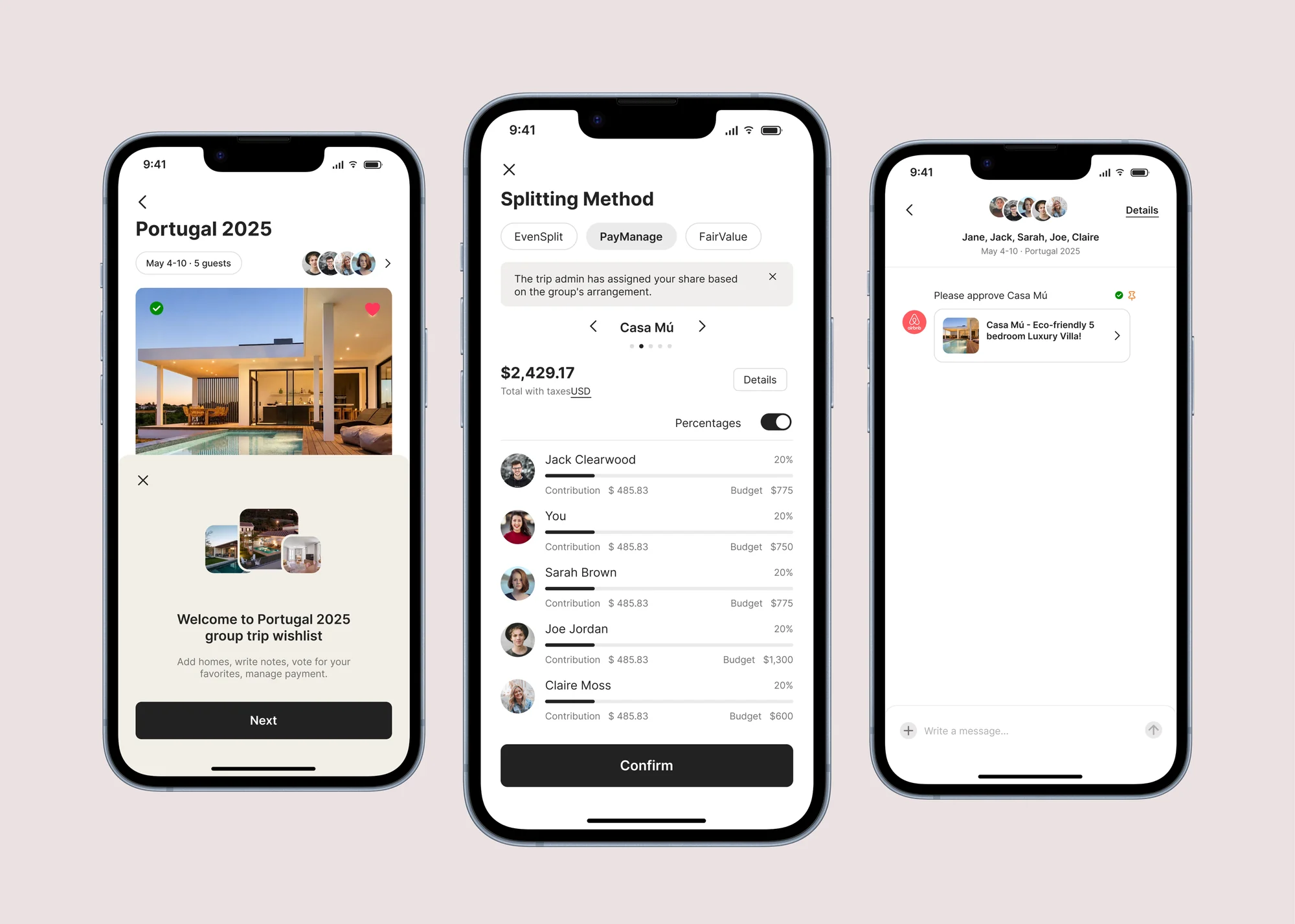
Airbnb group booking screens overview

We designed and distributed a structured survey to gather insights on how people currently navigate group bookings, not just the functional pain points, but the social and emotional friction.

82% of respondents wanted to split costs "fairly", but "fairly" meant different things to different groups. Some wanted even splits. Others wanted to pay proportionally based on room size or arrival dates. The current system supports none of this.

63% wanted payment reminders, not because they're forgetful, but because asking friends for money is uncomfortable. People wanted the platform to handle the follow-up so they didn't have to.

71% wanted to share the planning workload: the organizer role is exhausting. Respondents wanted tools that distributed this work across the group.

Splitting Method: three modes, not one. The survey killed the obvious solution first. 82% wanted to split "fairly," but fair meant even splits to some, proportional-by-room to others, and custom amounts to a third group. Any single split model would have alienated two-thirds of users no matter which one we picked. So the real decision wasn't which split is correct; it was to let each group declare its own definition of fair up front: EvenSplit for friends going halves, FairValue for proportional splits, PayManage for custom amounts.

Splitting method selection PayManage screen Wishlist admin budget view

Group Trip Hub: approvals as the fix, not a feature. If the core problem is that one person carries the whole trip, then one person also shouldn't be able to commit the group to it. The hub gives everyone a shared wishlist, voting, and end-to-end visibility, and requires group sign-off before anything books. That's a deliberate bit of friction: slower to commit, but it moves the power off the cardholder and onto the group.

Wishlist onboarding Wishlist admin view Approvals screen Trip details

In-App Messaging: keep coordination where the trip lives. Group trips normally get planned in a WhatsApp thread while the booking happens somewhere else, so context splits in two. We pulled messaging into the trip flow itself, with notifications scoped to the trip, so the conversation and the decision finally sit in the same place.

Messages overview Message thread Group join Payment join

Seamless Group Onboarding. Integrating the group feature into the wishlist flow made it intuitive for users to invite others. Users naturally understood how to start a group trip.

Clarity Drives Confidence. EvenSplit and FairValue were well-received for their simplicity. PayManage caused hesitation: users weren't sure who could see what, pointing to a need for clearer affordances around privacy and transparency.

Feedback & Visibility Matter. Users missed key elements like the comments section and expected notifications for group actions. When someone joins, approves, or pays, the group should know.

05 · Case Study

Gauge

I saw a broken process at my own company (paper forms, lost mileage reports, frustrated employees) and designed the fix.

RoleProduct Designer
CompanyBarge Design Solutions
TypeSelf-Initiated / Internal Tool
StatusSolo Project
Gauge app screens

As a Project Administrator at Barge Design Solutions (an architecture and engineering firm), I had a front-row seat to how broken the company's vehicle reporting process was. Mileage tracking was manual and inconsistent. Vehicle inspections were paper-based. Employees had no clear way to log trips or flag vehicle issues, and admins drowned in email chains and paper reports.

I identified the problem, pitched the solution, and designed Gauge, an internal vehicle report app that lets field employees scan a vehicle's QR code, complete inspections, log journeys, and automatically bill trip mileage to the right project.

I interviewed employees and shadowed the existing workflow, and the same three failures kept surfacing, each one a place where the paper process quietly cost the company time or trust:

Inconsistent Mileage Tracking. Mileage reporting was manual, prone to errors, and led to delays and distrust in reimbursements. Employees wanted a seamless, built-in way to track mileage on the go rather than reconstructing trips after the fact.

No Vehicle Inspection Process. Pre-trip inspections were either skipped entirely or done on paper that got lost. There was no consistent record of vehicle condition, creating liability gaps.

Manual Admin Processes. Admins relied on paper-based reports and email chains. Without centralized digital tracking, pulling reports or verifying trip data was tedious and error-prone.

Version 1 focused on getting the core workflow right: a home page with quick access to key actions, easy access to company car information, and a summary page to review submitted data. This version validated the basic flow: employees could submit and track vehicle reports digitally for the first time.

Version 2 got the job done but overbuilt it. A new safety compliance requirement meant adding vehicle inspections to the flow, and accommodating that made the design bulky: too many screens, too many steps. Users could complete the process, but testing revealed frustration. The app felt heavier than the paper version it was replacing.

Version 3 stripped it back. QR code scanning auto-fills vehicle information so users skip manual entry entirely. Trip mileage is the hero metric: it's the number that gets billed to projects, so it belongs front and center. The inspection checklist became a single tappable screen with flag capabilities. Fewer screens, smoother transitions, and micro-interactions that make the flow feel fast rather than bureaucratic.

Submission Without Struggle. All testers successfully submitted a report without needing help. The digital process was immediately faster and less error-prone than paper.

QR Scan = Instant Confidence. Auto-filling vehicle details via QR code eliminated a major friction point. Users no longer had to remember or look up plate numbers and odometer readings from memory.

Mileage Billing Clarity. Surfacing trip mileage as the hero number with a "Billed to project" badge gave employees confidence that their travel costs were being tracked and attributed correctly.

Gauge stayed as a prototype: leadership was excited about it, but internal politics made implementation difficult. That tension taught me something important: solving the design problem is only half the work. Navigating organizational dynamics to get solutions adopted is its own design challenge.

This project also shows something I value: I don't wait for a brief. I identified a broken process in my own workplace and designed the fix. That instinct, seeing systems that could work better and doing something about it, is what drew me to interaction design.

Capstone & Thesis · In Progress

Active Autonomy Companion

A digital nurse navigator that helps emergency room patients understand where they are, why they're waiting, and what happens next, in plain language.

RoleSole Designer & Researcher
DomainHealthcare · Emergency Care
MethodsService Design, Prototyping, A/B Testing
StatusIn progress · 2026

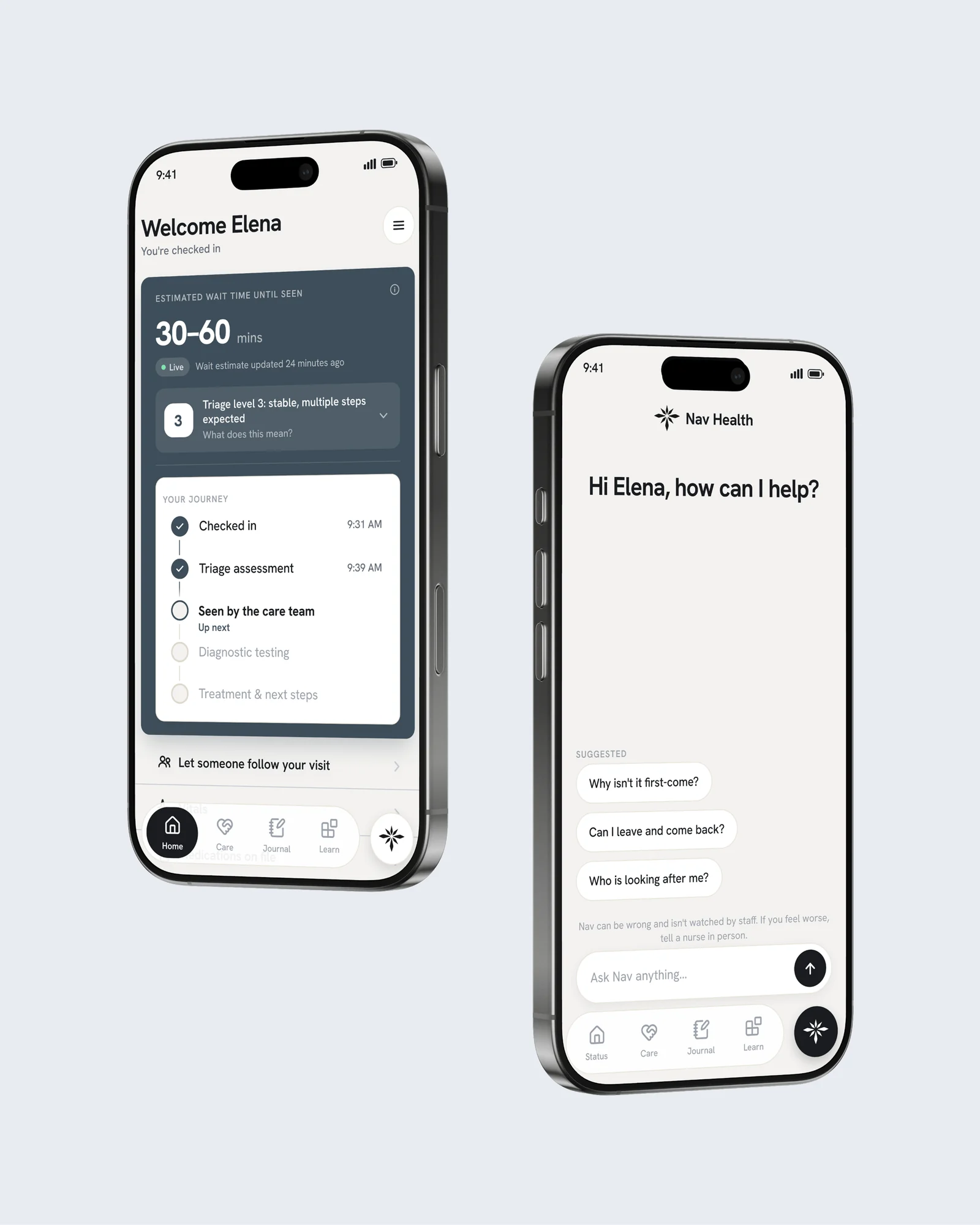
The emergency department is disorienting. You're anxious, often in pain, and rarely sure what's happening or how long it will take. Active Autonomy Companion is a digital nurse navigator that meets patients there. It explains where they are, why they're waiting, what their triage level means, who's on their care team, and what comes next, all in plain language.

The thesis: an anticipatory, AI-driven system should make people feel more in control, not less. It never hides what it's doing. It shows its work, sets honest expectations about wait times, and keeps patients oriented from check-in to discharge.

The patient experience under high cognitive load. The ER is a high-stress moment. People are anxious, in pain, and in no state to absorb complexity. I'm designing the screens that carry patients through a visit (the waiting view, journey timeline, care team, and discharge summary) to keep them calm and oriented, and A/B testing layout and navigation variations to find the clearest version.

Safe handling of patient data. Every screen touches protected health information, so I'm also writing the spec for handling it safely under HIPAA. The principle: treat the model as untrusted, and enforce anything that matters legally or clinically in code, not in a prompt.

AI that belongs in high-stakes spaces. The bigger question underneath it all: how do we design AI for environments like the ER so it's genuinely safe, helpful, and beneficial, rather than one more thing to manage?

More to come. This is my capstone, and it's actively in progress.

The full case study, prototype, and final deliverables will land here as it comes together.

Play · Gesture Prototype

Hand Tetris

Tetris where your webcam is the controller. Built with p5.js and ML5.js handpose: no keys, no props, just gestures (and a green hand skeleton straight out of Spy Kids).

RoleSolo Build
Toolsp5.js · ML5.js Handpose
ContextInteraction Design
TypeComputer-Vision Prototype

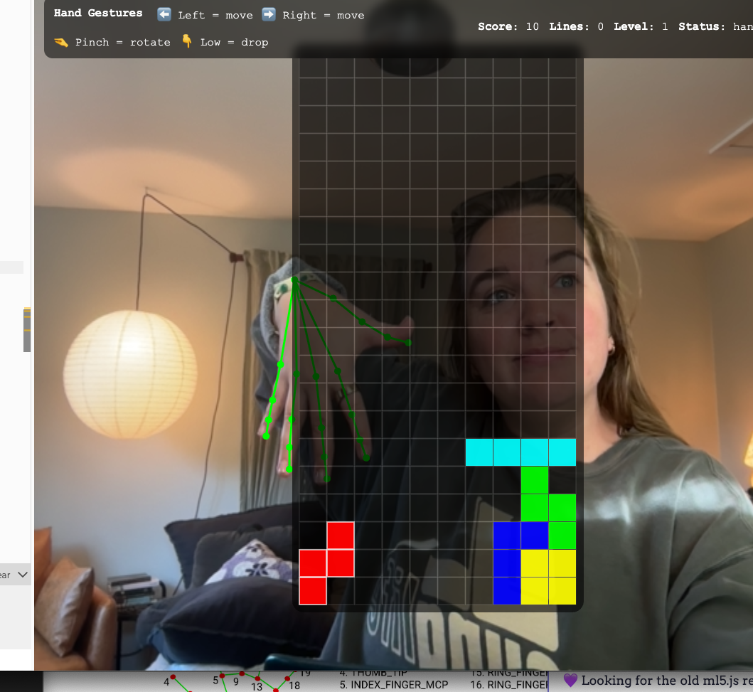
Allow camera access, then click into the frame. Move your whole hand left or right to slide the piece, bend your index or ring finger to nudge one tile, pinch to rotate, and drop your fingers below your wrist to hard-drop. Good lighting helps the tracking. Keyboard backups: arrow keys, space, and R.

Opens the live sketch in a new tab. Camera stays on your device.

It started as object recognition: controlling a game with cups and lids. I stripped the props out entirely and let the body become the controller. The interesting design question wasn't "can a hand control Tetris," it was what happens to play when the input is noisy, physical, and imperfect. Instead of hiding the jitter and latency of computer vision, the prototype leans into it. Your hand is never perfectly still, and the game has to make peace with that.

Five gestures map to the whole game. Hold hand left / right slides the piece. Index-finger bend nudges one tile; ring-finger bend nudges the other way. Pinch rotates. Fingers dropped below the wrist hard-drops. ML5's handpose gives 21 landmarks per hand, and I drew a live green skeleton over the camera so I could see, in real time, that the model was actually locked onto my hand.

The first working build was unplayable: far too sensitive. Even when I thought my hand was still, tiny wrist tremors read as movement, so the piece drifted on its own. The root cause: I was mapping wrist position to movement every single frame, and handpose updates many times a second, so any micro-variation flipped the "move" state. Noise was being treated as intent.

The fix was three layers of stabilization, which together turned movement into a tiny state machine. A deadzone ignores small drift around center, so the wrist has to travel a real distance before it counts as a direction. A delay proves intent, the first move fires instantly, but repeats only start after you've held a direction briefly, so a quick lean doesn't run the piece away. And a repeat rate makes held movement slide at a predictable speed instead of stuttering frame-by-frame.

The change matched the reality of how people actually hold their hands in front of a camera. Movement finally felt intentional instead of twitchy — and that one fix made the whole thing feel "playable."

The biggest visual bug: my green skeleton drifted off my actual hand. The camera was being drawn "cover style", scaled and cropped to fill the screen, but I was plotting landmarks in raw video coordinates, so the overlay never matched the transformed feed. I computed a matching cover transform (scale plus draw-offset) and ran every landmark through it before drawing, then flipped X because the camera is mirrored. After that, the skeleton locked onto my hand.
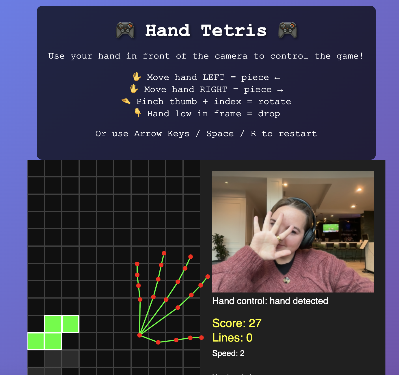
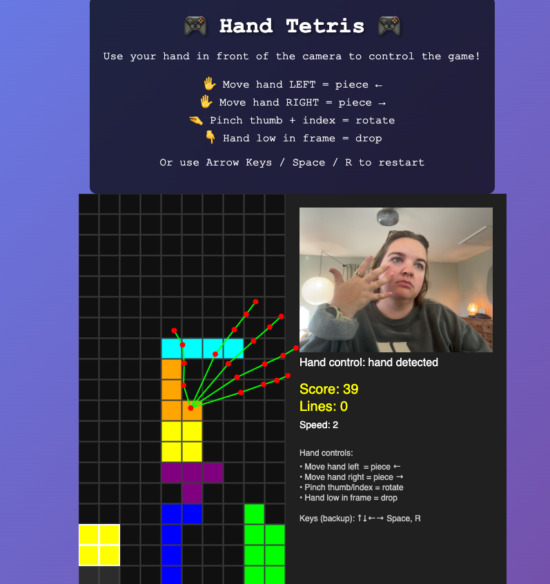
Overlay misalignment, the start of the problem Overlay still drifting, frustration building Green hand skeleton finally locked onto the hand
The start of the problem → frustration building → success.

Gesture control has a learnability problem: a successful gesture is invisible, so when something happens you don't know why. I added lightweight floating emoji that confirm what the model thinks you just did, a rotate symbol on a pinch, finger symbols with a direction on nudges, an upside-down hand on a drop. They act like a receipt for your intent, which dramatically cut the "wait, why did it move?" confusion during testing.

The feedback also exposed a hidden bug I'd never been able to see. Every pinch-rotation was often followed by an accidental index-bend nudge, one intent producing two actions. The emoji made the conflict obvious for the first time.
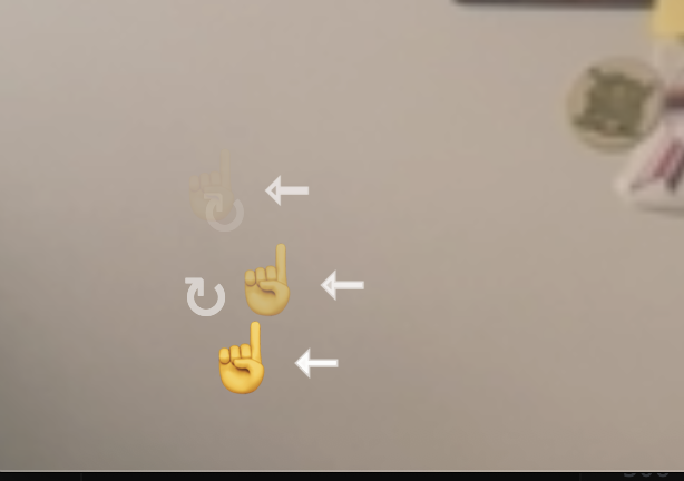
Emoji feedback revealing a gesture-conflict bug
The feedback system surfacing a gesture conflict

The fix was gesture arbitration: pinch-rotate became the higher-priority gesture, and firing it sets a short time-based lockout that blocks the lower-priority finger bends. Rotation stopped dragging the piece sideways. It still isn't perfect, but the controls started enforcing a rule people assume naturally, one gesture, one action.

I treated the p5 sketch as one component inside a designed interface, not "just a canvas." A clear hierarchy (title, instructions, live prototype) plus an onboarding screen that tells you what to try first while the camera initializes. The HUD always narrates what the system believes is happening ("hand detected" / "no hand"), so a missed hand or a lighting change reads as feedback instead of a mystery. I also dialed the webcam down to 640×480 on purpose: less pixel data per frame meant steadier tracking, a worthwhile trade for a slightly softer image.
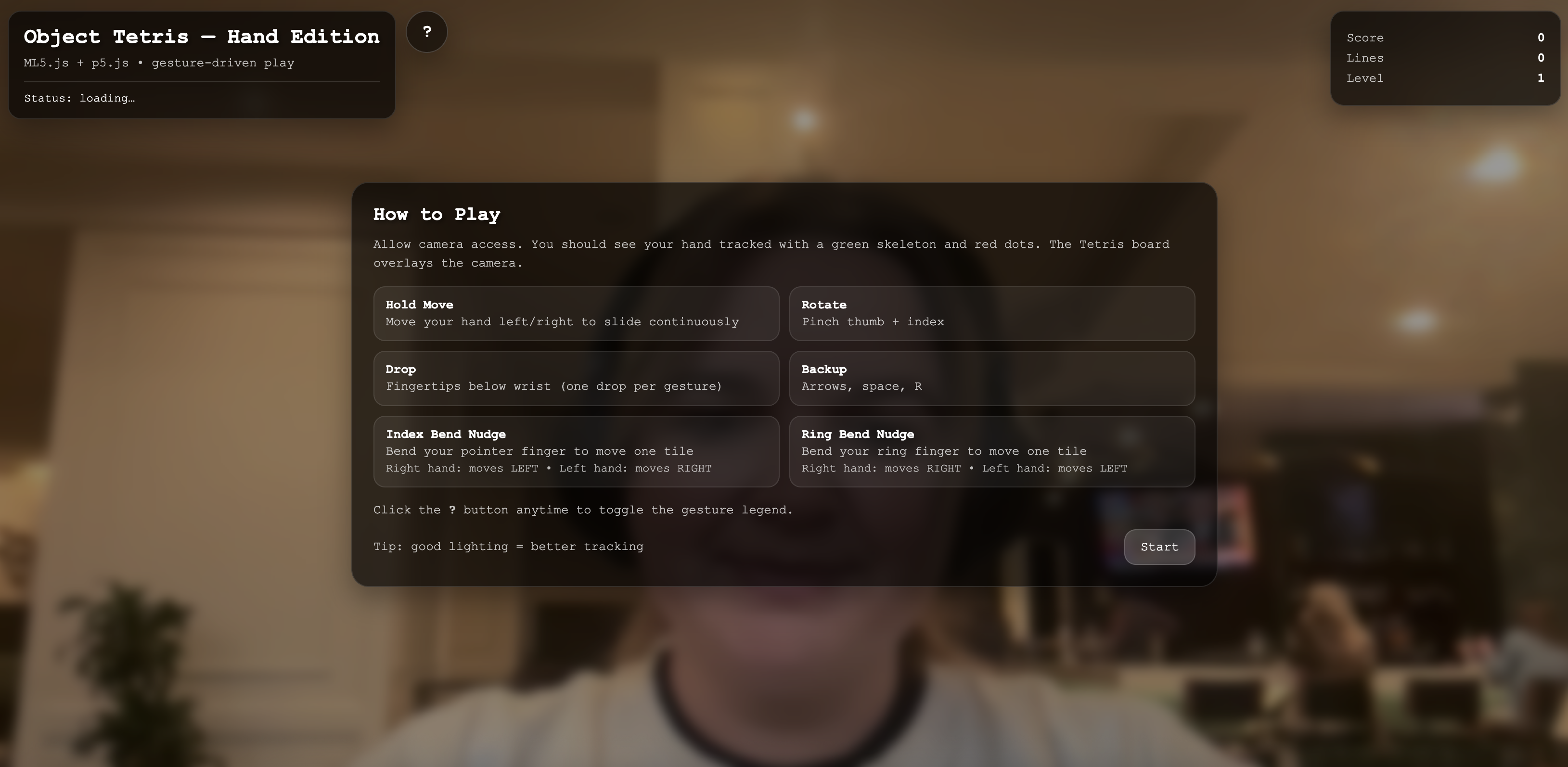
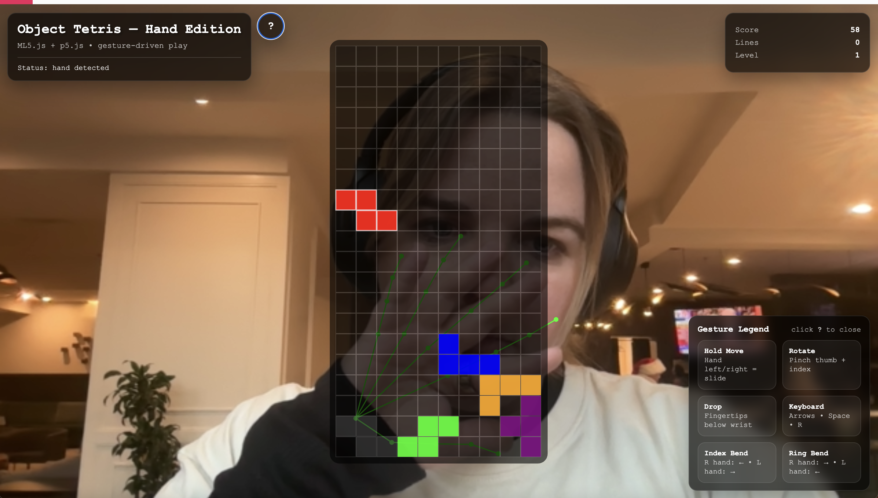
Onboarding How to Play screen Final game UI with board, score, and gesture legend over the camera feed
Onboarding screen and the final designed UI

Hand Tetris reframes gameplay as a negotiation between human motion and machine interpretation. Rather than optimizing for perfection, the system makes visible how our bodies adapt to imperfect sensing, and how much of "good" interaction is really just matching the machine's behavior to what people already expect their hands to do.

Also, I have to say: I love the drawn green hand. It makes me feel like I'm in Spy Kids. Just needed to profess that.